Design systems specialist enabling teams to ship consistent high-impact products at scale.

Promoting highly customisable component consumption

Designing systems that balance flexibility with long-term integrity.

Design systems2024–2025
Hero picture of NielsenIQ case study

As Global Design Systems Lead at NielsenIQ, I defined the strategy for scalable, highly customisable component architectures across a complex product ecosystem—supporting 300+ product professionals across distributed teams and product areas.

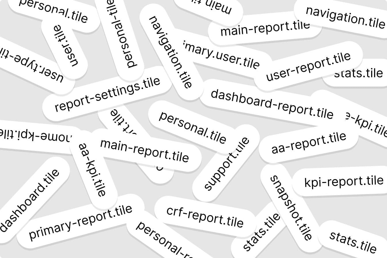
In large, fast-moving environments, feature teams are incentivised to move quickly and solve immediate problems. This often leads to the creation of one-off or feature-specific components, gradually fragmenting the system and increasing long-term maintenance costs.

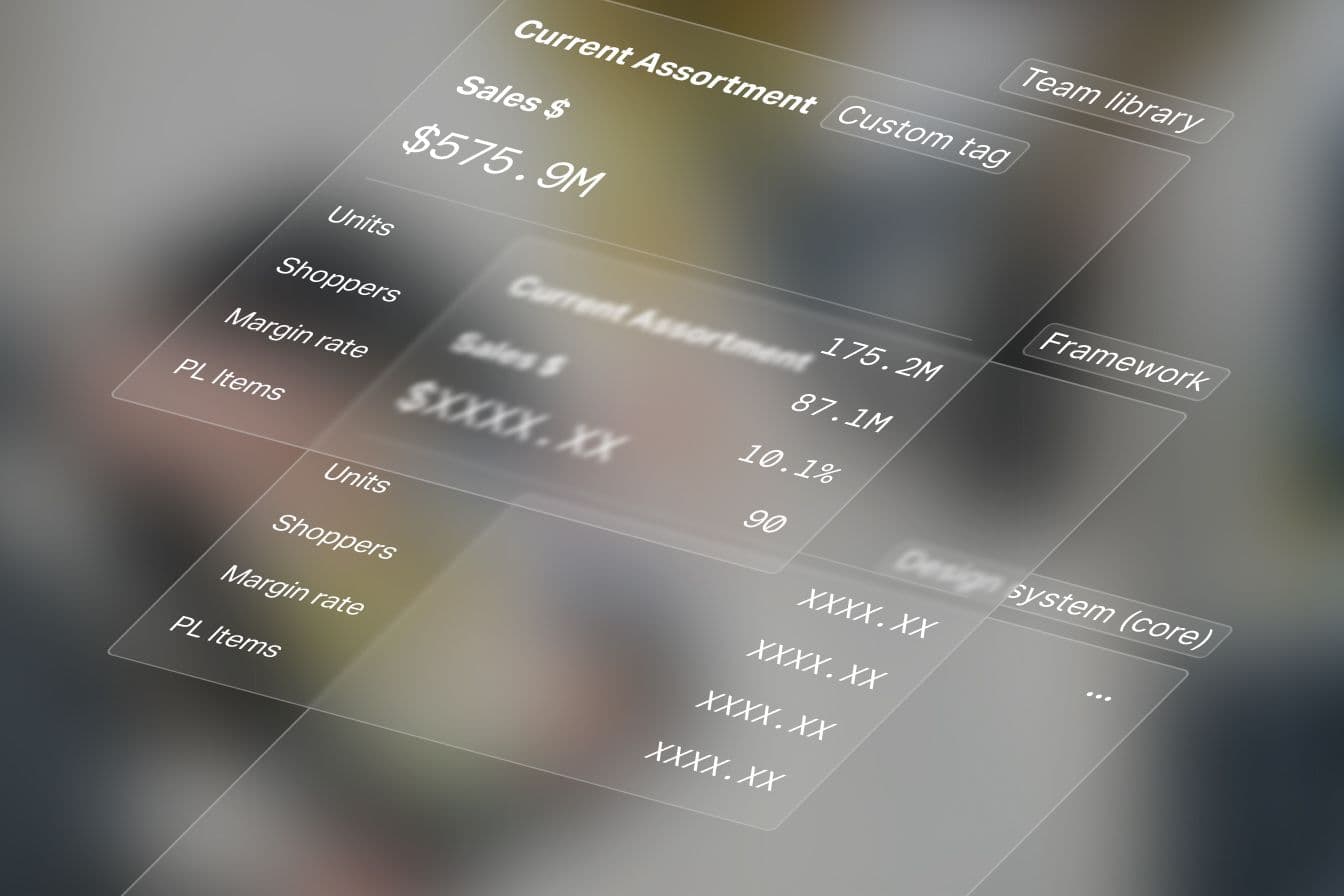
By introducing a layered component model, clear extension boundaries, and progressive adoption strategies, I enabled teams to move fast while preserving system integrity, accessibility, and scalability.

The challenge

The challenge wasn’t convincing teams to care about the design system—it was enabling them to move fast without creating long-term debt.

Building highly customisable components is inherently difficult. Trade-offs between flexibility, consistency, performance, and usability often push teams toward creating one-off solutions instead of adopting reusable system components.

Image of duplication of tile names

Over time, this led to fragmentation:

  • Duplicated components across teams
  • Inconsistent behaviours and patterns
  • Increasing design and technical debt

This tension played out daily. Teams were driven to ship quickly and prioritise immediate outcomes, often at the expense of long-term consistency. The design system risked being seen as a blocker rather than an enabler.

Product teams’ primary concern is getting work out the door, not upholding the integrity of the design system.
Brad Frost

As Brad Frost puts it. The challenge was to strike the right balance—offering enough flexibility for teams to move fast, while maintaining the structure needed to avoid fragmentation, duplication, and growing design and engineering debt.

Designing for controlled flexibility

Flexibility doesn’t scale on its own—it requires structure, boundaries, and shared understanding.

In large product organisations, systems that are too rigid become blockers, while systems that are too flexible lose coherence over time. The challenge is not choosing between flexibility and consistency, but designing a system that enables both to coexist.

Designing for controlled flexibility means defining where the system is stable and where it can evolve—allowing teams to move fast without creating fragmentation or long-term debt.

In this context, flexibility is not the absence of constraints—it is the result of well-designed ones.

Approach

This was not approached as a component problem—it was treated as a system architecture and adoption challenge.

Rather than enforcing rigid standards, we focused on creating a model that allowed teams to customise responsibly while maintaining a consistent and scalable foundation. This shifted conversations from isolated component decisions to shared system thinking across design, product, and engineering.

Fragmented elements

  • One-off tiles
  • Duplicated logic
  • Inconsistent UX

Controlled flexibility

  • System core
  • Framework layer
  • Team extensions

Scalable system

  • Reusable components
  • Consistent patterns
  • Reduced technical debt
Image of a layered component approach

A layered component model

Customisation becomes scalable when it is structured across clearly defined layers.

To address fragmentation, we introduced a layered architecture that separated concerns across multiple levels of the system. This model allowed teams to customise components without compromising the integrity of the design system.

The architecture was structured across three layers:

Design system (core)

Foundational structure, accessibility, and core behaviours.

Framework layer

Shared logic, composition, and extensibility.

Team libraries

Contextual styling and feature-specific adaptations.

By clearly defining where flexibility lives, teams were able to extend components safely while preserving consistency and maintainability.

Accessibility as a first-class constraint

Accessibility wasn’t an afterthought—it actively shaped how components were designed and structured.

Achieving correct keyboard interactions required restructuring the underlying layout, prioritising logical navigation and predictable behaviour over visual convenience.

This ensured components were not only flexible, but also inclusive and production-ready across use cases.

Image of keyboard navigation handoff specification

Iteration through alpha releases

This work didn’t just standardise naming—it changed how teams collaborate and scale.

To reduce risk and improve adoption, we released alpha versions of components in both code and Figma. This allowed us to:

• Identify issues early
• Validate customisation patterns
• Collect feedback from real users

While this extended release cycles, it prioritised long-term quality, collaboration, and system sustainability over short-term speed.

Impact

This work didn’t just improve components—it changed how teams consume, extend, and trust the system.

By introducing a shared model for flexibility, we enabled teams to move faster while maintaining consistency and scalability across products.

Adoption

Teams were more willing to adopt shared components by enabling controlled flexibility, increasing design system usage across multiple product teams.

Reduced debt

Clear extension boundaries reduced one-off solutions and improved long-term maintainability across design and engineering.

Accessibility

Structural decisions and keyboard interaction improvements resulted in more inclusive, production-ready components.

Trust

Feature teams felt supported rather than constrained, strengthening trust in the design system as a partner rather than a blocker.

Highly customisable components succeed when teams understand where the system is stable, where it can flex, and why those boundaries exist. By aligning architecture, consumption, and governance, we enabled teams to move fast without compromising consistency, accessibility, or scalability.

Image of a tile using the new component approach

Final thoughts

Design systems succeed when they balance flexibility with structure—enabling teams to move fast without losing coherence.

Design systems are not just components—they are the systems that enable teams to scale effectively. When designed with the right balance of flexibility and structure, they empower teams to move faster while maintaining long-term integrity.

NielsenIQ is the world's leading consumer intelligence company, delivering the most complete understanding of consumer buying behaviour and revealing new pathways to growth.

nielseniq.com

NielsenIQ

Information Services